
When the Venturus Marketing team decided it was time to revisit the brand, there was no hesitation: the process had to be conducted internally.
After all, no one knows Venturus—its culture, rituals, and technological challenges—better than the people who live and breathe the company every day.
Thus, led by Vinicius Santos (Creative Visual Lead) and Hanna Teixeira (Visual Designer), a deep and complex project was born: the Venturus 2025 Rebranding.
The initiative spanned seven months and blended research, strategy, geometry, semiotics, application testing, delicate typographic decisions, and, of course, countless rounds of drafting, exploration, and refinement.
This article is a deep technical dive into that process.
1. The Challenge: A Brand Outpaced by Company Evolution
The 2018 identity worked well, particularly when the Marketing department was still in its embryonic stages. However, four years later, the company had expanded significantly into:
- Artificial Intelligence
- Quantum Computing
- Blockchain
- Advanced Engineering and Manufacturing
Simultaneously, the Marketing team had matured, becoming data-driven and backed by a robust content system. The old brand simply no longer reflected who Venturus had become.
The diagnosis highlighted four main issues:
- Inappropriate Palette for B2B: The predominant use of pink and purple created friction in dialogues with strategic sectors like manufacturing, healthcare, energy, and logistics.
- Lack of Proprietary Visual Language: The brand lacked distinct elements that reinforced consistency or generated immediate recognition.
- Outdated Positioning: The brand narrative had lagged behind the company’s technological and strategic evolution.
- Accelerated External Changes: The post-pandemic world, the rise of Generative AI, and new technological frontiers demanded a more contemporary and sophisticated narrative.
2. The Methodology: Branding with Technical Rigor
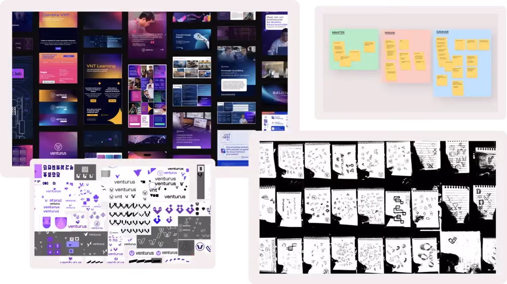
To ensure strategic depth, the team sought certification in the proprietary method of Ana Couto, a benchmark for branding in Brazil. The process followed four major stages:
- Simultaneous Investigation: Internal and external interviews, plus desk research.
- Value Decoding: Mapping drivers, detractors, and accelerators.
- Branding Platform: Defining the value proposition, archetypes, attributes, and strategic principles.
- Creation: The visual and technical phase where the brand takes shape.
From this phase, the Core Value Proposition was born:
“We are a Technology Center that transforms challenges into innovative solutions, impacting lives and shaping the future.”
And the archetypes that would set the brand's tone: The Sage (experience and knowledge) and The Creator (invention and imagination).
3. Technical Construction of the Symbol—Where Design Truly Begins
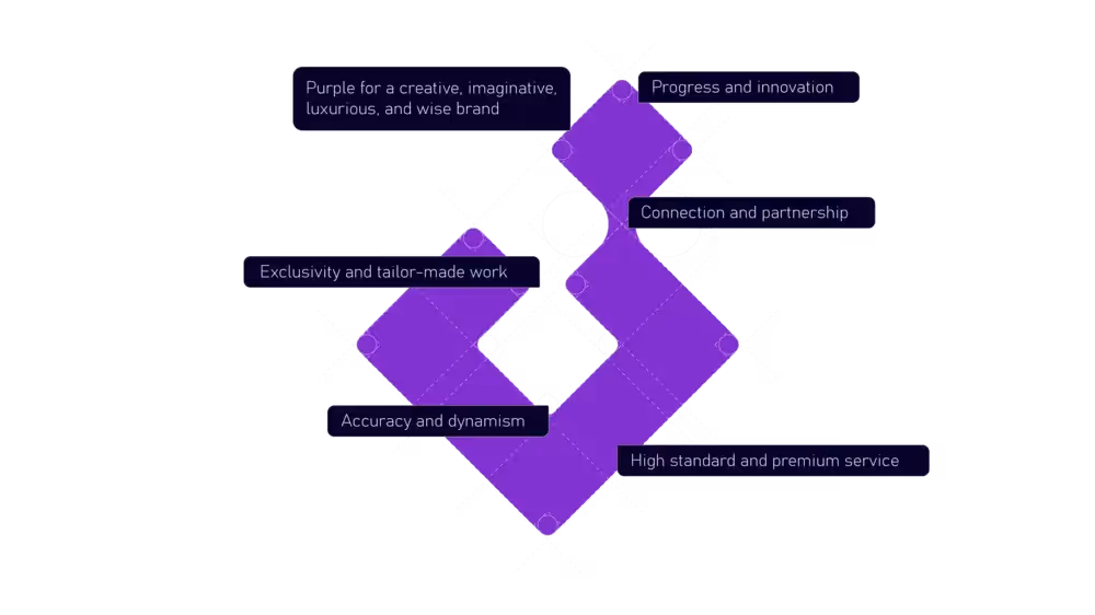
The “V” as a Geometric Monogram
The new symbol emerged from a deep exploration of semiotics and primitive shapes. The goal was to create something modern, precise, simple, and symbolic, with a deep connection to technology and partnership.
The Mathematical Basis
.avif)
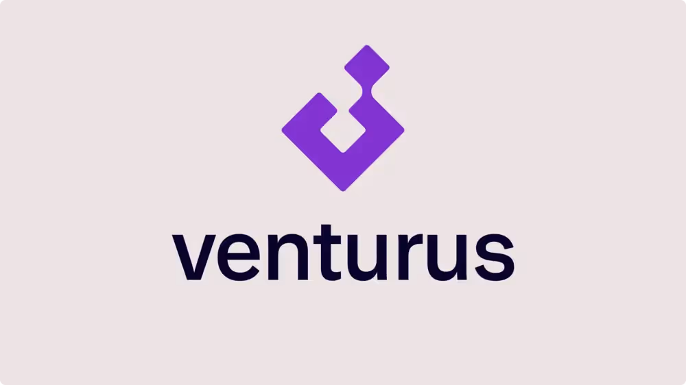
The Venturus “V” is not merely a stylized letter: it is the intersection of two squares rotated at 45°, constructed using the Golden Ratio.
Important Technical Details:
- The Larger Square: Represents stability, structure, and knowledge. It symbolizes the Technology Center, the Institute (The Sage).
- The Smaller Square: Created by reducing the larger square twice via the Golden Ratio. It emerges from the center and is positioned at the top, reinforcing movement, progression, and bespoke creation (The Creator).
- The 45° Rotation: Creates dynamism, symbolizing advancement, speed, and precision.
In this system, nothing is decorative—every element serves a symbolic and visual function.
4. Intentional Contrast: Organic Symbol + Precise Typography
A detail often missed at first glance, yet one of the most technical decisions of the project: The symbol has rounded corners. The typography has sharp corners.
This was not accidental.
Why?
- The Symbol needed to convey welcoming warmth, movement, and fluidity.
- The Typography needed to convey precision, robustness, and authority.
This contrast reinforces the brand's essential duality:
- Human × Technological
- Creative × Scientific
- Innovative × Reliable
Chosen Typography: Early Sans (Medium)The selection criteria included:
- Legibility across various sizes.
- Sophisticated neutrality.
- Compatibility with the symbol's geometric style.
- Visual contrast between rounded corners (symbol) and straight edges (text).
- Modernity without sacrificing seriousness.
5. The Typographic System for Communication—The Invisible Challenge
A real issue with the old brand was font inconsistency in PowerPoint. The Marketing team struggled with automatic font substitution, formatting loss, and errors between desktop and online versions.
To solve this, we needed a font that was:
- Visually aligned with the new positioning.
- Multi-purpose.
- Native or embedded in PowerPoint.
- Elegant, clear, and commanding.
The solution was adopting Grandview for body text and institutional materials.
The result:
- Greater consistency across documents.
- Less rework for the team.
- Visuals aligned with the rebranding.
- Improved accessibility and performance.
This type of decision doesn't show up in the logo—but it deeply impacts communication efficiency.
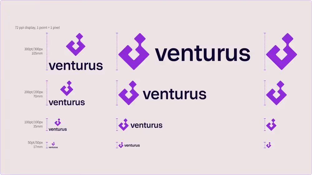
6. Legibility Tests: The Symbol Must Work in the Real World
Venturus is a brand representing a physical place and real projects serving real people, yet it is also heavily present in the digital space. Therefore, building a visually interesting symbol is useless if it fails in practical application.
The team conducted rigorous testing on:
- Scalability
- Contrast
- Small screens
- Print materials
- Quick applications
These were pain points with the previous logo. The test results defined the minimum sizes:
- 50px for screens
- 17mm for print
These specifications ensure the symbol maintains clarity, visual weight, and formal integrity, even in reduced spaces.
7. Tools and Production Pipeline
The creative workflow was divided between:
- Figma: Organization of ideas, mood boards, conceptual grids, and strategy guidelines.
- Illustrator: Technical construction of the symbol, vectorization, geometric grids, Golden Ratio calculations, and fine-tuning of shapes.
This pipeline allowed for mathematical precision combined with creative experimentation.
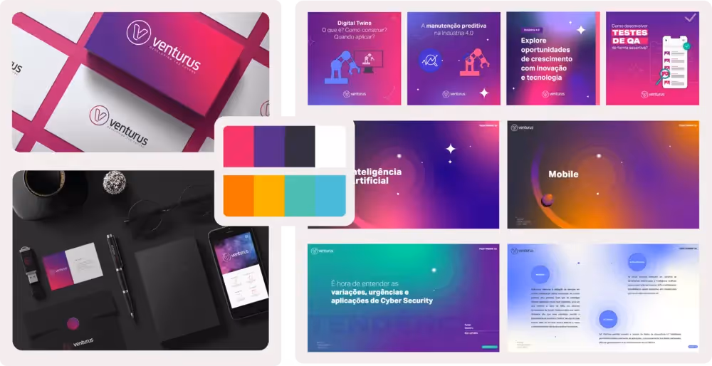
8. From Symbol to System: Creating a Living Visual Language
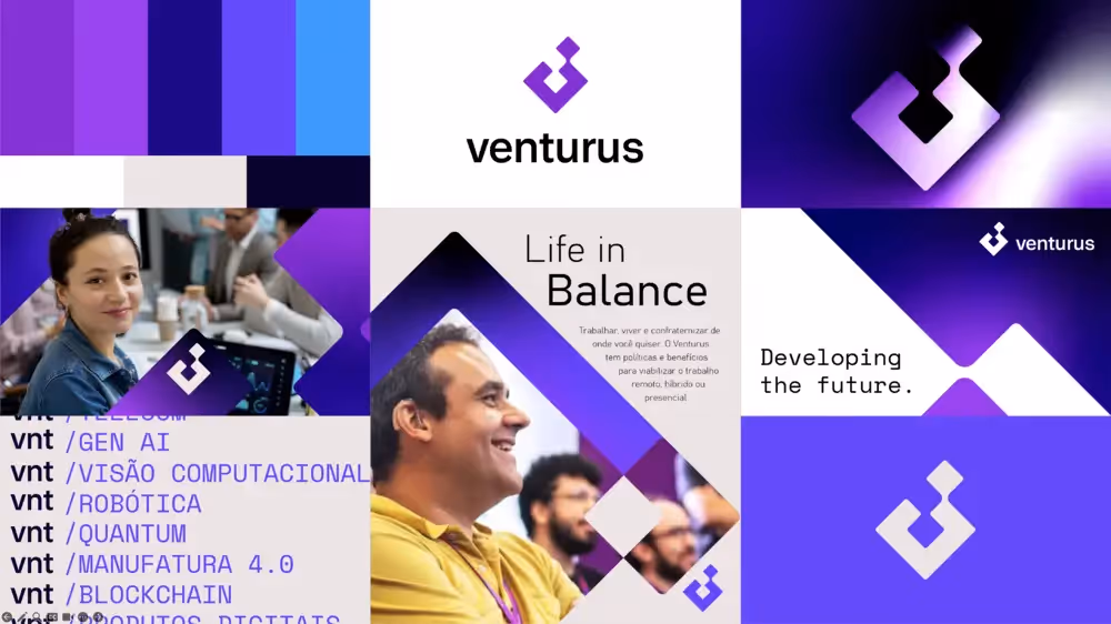
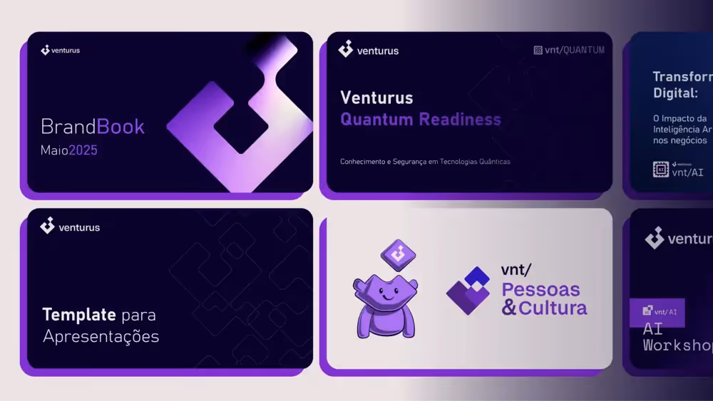
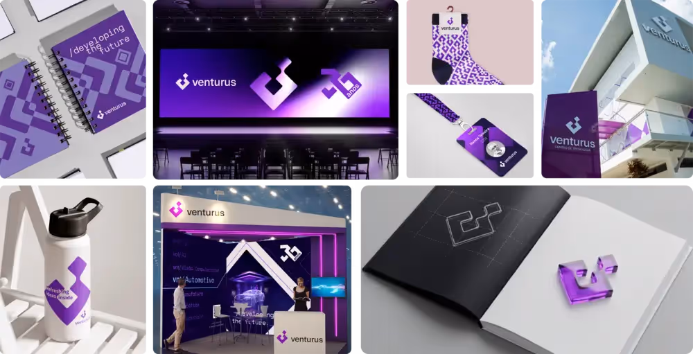
The new identity was conceived as a system—not just an isolated logo. This included:
- Layouts based on modular grids.
- Patterns inspired by the symbol's angles.
- Hybrid use of rounded and sharp corners (reinforcing the brand duality).
- Minimalist key visuals.
- Geometric iconography.
- Visual constructs for posts, presentations, documents, and social media.
All of this is documented in the Brand Book delivered as part of the project.
9. Real-World Testing Before the Official Launch
Before the public rollout, the team applied the brand in a "Beta Internal" phase, using it for:
- Institutional videos
- Social media posts
- Sales materials
- Thumbnails
- Internal presentations
- Events
This period allowed us to fine-tune the palette, hierarchies, typographic weights, proportions, layout rhythm, and spacing.
10. A Revamped Website for a Revitalized Brand
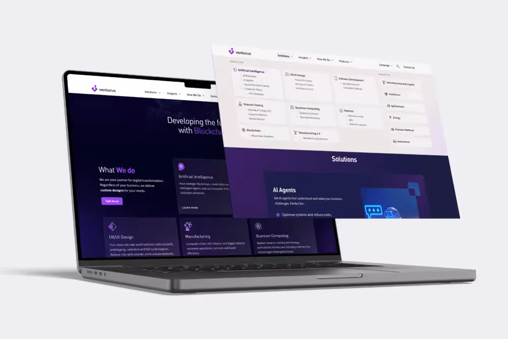
The rebranding deeply impacted the website redesign. The new visual language became:
- More technological.
- Cleaner.
- More "authorial."
- Better aligned with the positioning of a Technology Center.
The site now fully utilizes the new identity system.
Conclusion: A Brand Uniting Rigor, Meaning, and Evolution
The Venturus rebranding is not just a new visual identity. It is the materialization of everything the company has become—and everything it aims to build moving forward.
It combines:
- Geometric precision
- Deep strategy
- Applied semiotics
- An evolutionary design system
- Typographic consistency
- Real-world testing
- Storytelling and technology
And above all: it was created by the people who live Venturus every day.
“We built a brand to serve the company’s strategy—but also to grow alongside it.”— Vinicius Santos
The entire process is summarized in the video below, marking this transformation of the Venturus brand.